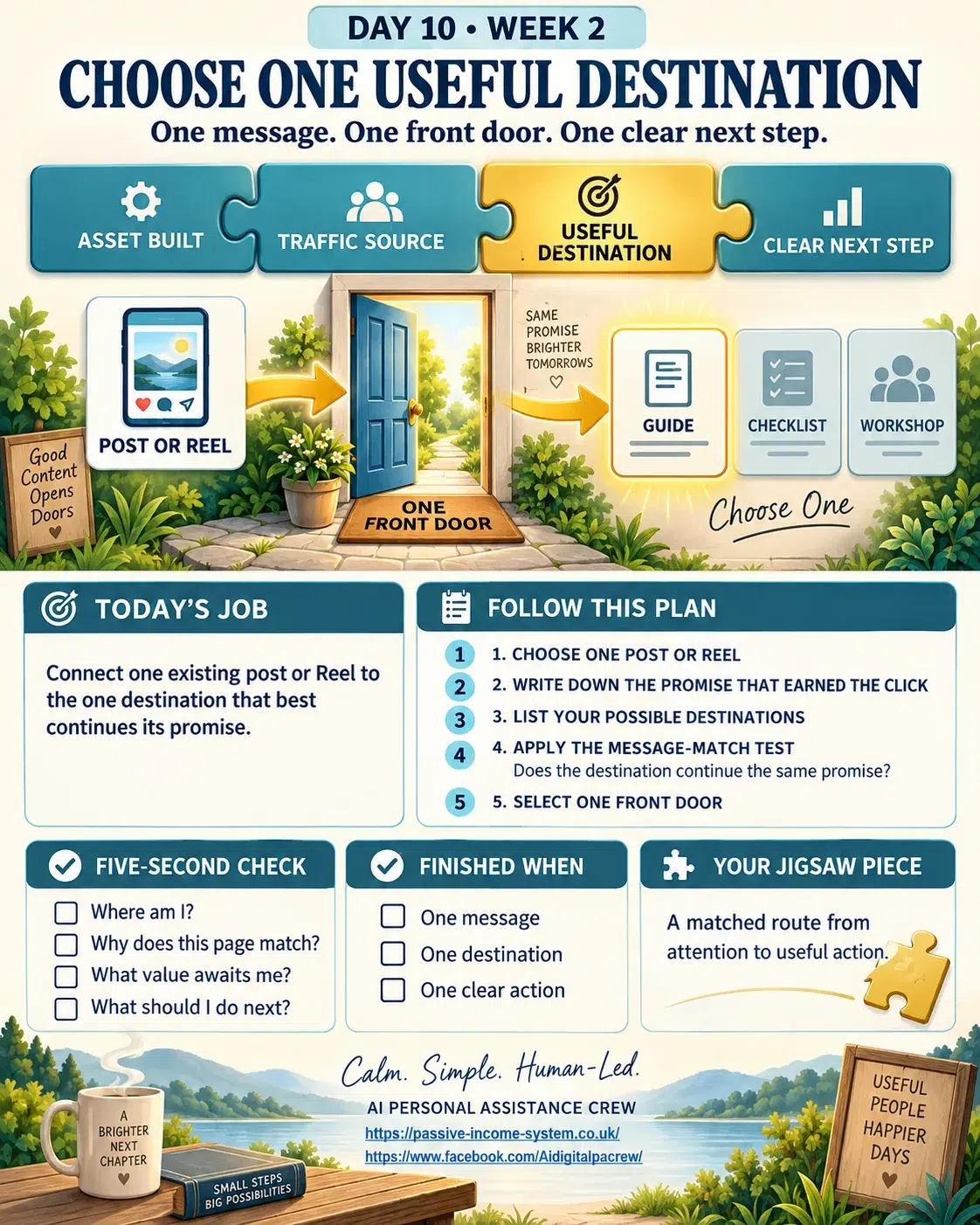
Choose One Useful Destination: Every Post Needs One Clear Front Door
One clear destination prevents helpful content from becoming a confusing collection of competing choices.
Help Every Reader Choose One Useful Destination
The best next step continues the original promise and matches the reader’s present level of interest.
Turn Borrowed Attention Into Progress You Control
Guide interested social visitors towards your website, useful asset, checklist or beginner-friendly workshop.
Several links may look generous, but each additional option asks the reader to make another decision before moving forward.
Let One Clear Next Step Continue The Original Promise
The right destination should feel like the natural next room, not an unexpected detour into a different building.
It was the sort of village shop that seemed determined to sell everything except the thing you had entered to buy. Newspapers leaned against birthday cards. Bags of compost guarded the bread shelf. A display of phone chargers blocked the route towards the milk, while handwritten notices invited customers to join a raffle, book a coach trip and buy a second-hand lawnmower. Somewhere behind it all, a cheerful shopkeeper was asking whether you had considered changing your electricity supplier. You could admire the enterprise, but after five minutes of hunting for a loaf, even the most patient customer began edging towards the door.
Online visitors behave much the same way. They may arrive because one useful Facebook post caught their attention, only to land on a page offering six articles, three downloads, a newsletter, a workshop, a product and a button marked “Learn More” without explaining what they are supposed to learn. Every choice may be perfectly respectable, yet together they create a small fog of hesitation. The visitor stops following your message and starts designing their own route. Most won’t complain. They will leave. That is why every piece of traffic content needs one front door. The post creates interest, while the destination continues it. Nothing else should compete for the reader’s first decision.
The Reader Should Never Need A Map
 A retired heating engineer could write a useful Facebook post explaining why one cold radiator doesn’t always mean the boiler has failed. The reader recognises the problem, follows the explanation and reaches the end wanting to know what to check next.
At that moment, the natural destination might be a simple household checklist called Five Checks To Make Before Calling A Heating Engineer. The post has raised one practical question, and the checklist answers it. The journey feels obvious because the destination continues the same conversation.
Now imagine that the final paragraph instead offers a homepage, a YouTube channel, an email newsletter, a paid consultation and a general guide to reducing household costs. None of those destinations is necessarily poor, but the reader must suddenly decide which one matches the reason they stopped. A menu has replaced the useful momentum the original post created. This is the hidden cost of giving people “plenty of choice.” Each option introduces a fresh decision, and each decision gives hesitation another chance to intervene.
The One-Door Rule removes that burden. It says that one piece of traffic content should lead towards one useful destination. Other opportunities can appear later, once the reader has received the value they expected. The front door doesn’t need to reveal every room in the house. Its job is to make the first step feel safe, relevant and worthwhile.
Choose One Useful Destination That Matches The Promise
The best destination isn’t automatically the most valuable page to the business owner. It is the page that best continues the reader’s present interest. That distinction matters because creators often choose links according to what they want people to buy rather than what the visitor is ready to do. A stranger who has watched a forty-second Reel may be interested enough to read a practical article but not ready to study a complete sales page. Sending that person straight to the biggest commitment can turn a promising first meeting into an uncomfortable conversation.
Think of it as arriving at somebody’s home after asking for directions. If they answer the door and immediately try to sell you the furniture, you may wonder whether you knocked at the wrong house. Online journeys can produce the same feeling. The Reel promised a quick explanation. The linked page suddenly demands an email address, introduces an unrelated product or begins telling a long personal story before confirming that the visitor has reached the right place.
To choose one useful destination, begin with the promise that earned the click. What question was opened? What problem was recognised? What useful result did the reader expect to move closer towards? The destination should confirm that promise immediately through its headline, opening sentence and first visible action. When those elements agree, together, the reader doesn’t need persuading that they have arrived correctly. The page itself provides the reassurance.
The Message-Match Test Helps You Choose One Useful Destination
Before adding a link to any post, place three things beside one another: the post’s main hook, the destination page headline and the action you want the visitor to take. Read them as though you had never seen the business before. Do they feel like three parts of the same journey, or does one suddenly introduce a different subject?
Suppose a Facebook post begins with: “Your lifetime experience may already contain the makings of a useful digital guide.” The chosen destination is the Passive Income-InIncome-SystemSystem workshop, where retirees can begin turning practical knowledge into a simple asset. That route makes sense if the destination headline immediately confirms that beginners can start with experience they already possess. The reader follows one idea from the social post into a fuller lesson without being forced to reinterpret why they clicked.
However, if the same post leads to a page headed “Discover Today’s Most Profitable Artificial Digital Products,” the message has changed. The visitor arrived thinking about the value of personal experience. The destination begins talking about profitable markets. Even when both pages belong to the same overall business, the journey feels broken.
This is the Message-Match Test: Does the destination continue the exact promise that opened the door? If the hook, headline and next action cannot sit comfortably in one sentence, choose a better destination or adjust the message before publishing.
One Door Doesn’t Mean One Final Outcome
Some beginners worry that choosing one destination will limit what the reader can eventually discover. In practice, the opposite is often true. A clear first step earns the attention needed for a second step. Once someone has received the promised checklist, read the relevant article or completed the opening workshop task, you can introduce other routes naturally. The reader is no longer standing outside deciding whether to enter. They have already experienced something useful and can make the next decision with better information.
The mistake is trying to compress the entire customer journey into the first post. A creator wants the reader to visit the website, join the list, watch the video, download the guide, inspect the offer and follow three social channels before the kettle has boiled. The result resembles that crowded village shop, full of worthy intentions but difficult to navigate.
A useful destination should perform one immediate job well. It might answer the question raised by the post, provide the promised resource or begin the process the reader wants to follow. Its success isn’t measured by how many doors it displays. It is measured by whether the visitor can recognise where they are, understand why the page matters, and take the next sensible action without assistance.
That is how traffic stops behaving like a collection of passing clicks and begins becoming a guided journey.
Borrowed Attention Works Harder When You Choose One Useful Destination
Facebook, Instagram, YouTube and TikTok can introduce your work to people who might never have found your website on their own. They are useful meeting places, but they remain borrowed ground. The platform decides how widely a post travels, how long it stays visible, and what changes it will make to the rules next month. You may attract attention there, but you cannot assume it will be available whenever you need it.
This is why the destination matters more than the platform statistics suggest. A Reel may collect views, reactions and comments, yet produce no lasting progress if interested viewers have nowhere relevant to continue. The activity looks encouraging while it is happening, but it disappears down the page as newer content arrives. A useful destination changes the Reel’s job. Instead of trying to contain the entire lesson, it becomes a clear invitation into something more dependable, such as an article, guide, checklist, workshop or email relationship that you control.
The social platform introduces you. Your destination continues the relationship. This doesn’t mean dragging every viewer towards a sales page. It means rewarding genuine interest with a place where the reader can explore the same subject in greater depth. Borrowed attention becomes owned progress only when the visitor can move from somebody else’s platform into a useful environment you have built.
Match The Destination To The Reader’s Present Interest
Not every visitor is ready for the same next step. Someone who has watched one short video may only want a clear explanation. A regular reader may be ready for a worksheet. A person who has completed several workshop tasks may want to examine a product or paid service. Sending all three people to the same destination ignores the trust and interest each has already shown.
The smallest useful next step is often the strongest. It asks the reader to continue rather than leap. A Facebook post explaining how retirees can identify one useful lesson from their working life might lead towards a related blog article. The article could then introduce a worksheet that helps the reader capture that lesson. After using the worksheet, the person may be ready to enter the wider workshop. Each destination earns the right to introduce the next one because it has already delivered something useful.
This differs from hiding the sale or building an unnecessarily long funnel. The purpose is to respect the reader’s starting position. If a person has shown a small amount of interest, offer a small but meaningful continuation. If they have shown stronger intent, a larger step may feel appropriate.
Use this decision rule: the destination should require no more commitment than the content has earned. That one sentence can prevent a helpful post from ending with a request that feels premature.
The Five-Second Test Confirms You Chose One Useful Destination
A visitor shouldn’t need to study the destination page before discovering whether they have arrived in the right place. The first visible section should answer four quiet questions almost immediately: Where am I? Why does this relate to what I clicked? What useful value awaits me? What should I do next?
Imagine a retiree clicking from a Facebook post about turning lifetime experience into a simple digital asset. The destination opens with the headline, Turn Your Lifetime Experience Into Digital Value. Beneath it, a short sentence explains that the workshop will help beginners choose one useful idea and shape it into an asset. A clearly labelled button invites the visitor to begin the first task. Even before reading the rest of the page, the person can recognise the connection between the post and the destination.
Now picture the same visitor arriving on a homepage covered with recent articles, category lists, advertisements, social buttons and several unrelated offers. The workshop may be present somewhere, but the reader must hunt for it. The click was successful in a technical sense, yet the journey failed at the front door.
The Five-Second Arrival Test isn’t about forcing every page into an empty design. It is about making the main route unmistakable. If the visitor can quickly confirm the subject, value and next action, they are more likely to keep reading. If they must investigate the page before understanding it, the destination is asking them to do work that the creator should have done. When you choose one useful destination, the reader no longer has to design their own route.
Remove Whatever Competes With The First Decision
Improving a destination often requires subtraction rather than another tool, graphic or block of copy. A second button may appear helpful but introduce a competing decision. A large menu may offer freedom while encouraging the visitor to wander away. An unrelated promotion may earn an occasional click but weaken the promise that brought the reader to the page.
This doesn’t mean every destination must contain only one button or remove the website navigation permanently. It means the first visible decision should remain dominant. Other choices can appear after you’ve introduced or delivered the promised value. The visitor should never have to compare several unrelated routes before taking the step the original content prepared them to take. The easiest way to choose one useful destination is to continue the promise that earned the click.
A retired gardener sharing a short video about sowing tomatoes could link to a seasonal planting checklist. At the top of that page, the checklist should be the obvious next action. A link to a gardening course may appear later, once you’ve explained the promised resource. Placing the course, newsletter, equipment recommendations and social channels above the checklist would turn one clear doorway into a railway station.
When you choose one useful destination, ask what could distract the visitor during the first few seconds. Remove, move or reduce anything that competes with the expected next step. Clarity isn’t created only by adding better instructions. It is also created by taking unnecessary decisions out of the reader’s way.
Follow One Reader From Post To Destination
Creators usually examine posts and pages separately. They improve the social caption, then later improve the website headline, without walking through the complete experience as a visitor would. This can leave two individually respectable pieces of content joined by an awkward handover.
A better check is to follow one imaginary reader through the entire route. Begin with the first sentence of the post. Notice what expectation it creates. Read the final call to action and click the destination. Then stop looking at the page as its owner. Look at it as the person who has just arrived.
Can the reader see the connection without remembering every word of the original post? Does the page reward the click before asking for another action? Is the desired next action clear enough to complete without instructions? If the visitor takes that action, do they receive exactly what was promised?
This short walk-through reveals problems that individual page reviews miss. The call to action may promise a checklist while the destination calls it a workbook. The post may speak to complete beginners while the landing page assumes previous knowledge. The destination may offer the right resource but hide it beneath a long introduction.
Traffic paths break at their joins. Following one reader from beginning to end helps you inspect those joins before sending more people along the route. Before publishing, choose one useful destination that matches the reader’s present level of interest.
Open to See This Video, And This Is What’s Already Built,
Trained & Waiting For Your First Command.
Today’s Apprentice Task: Build One Front Door
Choose one post, video or Reel that already attracts the kind of person you want to help. Don’t create something new today. Use an existing piece so you can concentrate on improving where it leads.
Write down the main promise or question contained in that content. Next, list the possible destinations you currently offer, such as an article, checklist, guide, workshop, email sign-up or sales page. Select the one destination that best continues the original promise and suits the reader’s present level of interest.
Now complete these five checks:
- Does the content lead towards only one main destination?
- Does the destination headline continue the original subject?
- Is the next step small enough for the interest already earned?
- Can a new visitor recognise the value within five seconds?
- Does one clear action dominate the first visible section?
Remove or postpone any competing links that weaken the first decision. Then read the post, click the link and experience the complete journey as though you were arriving for the first time.
Your finished jigsaw piece today is not merely a link. It is one dependable front door connecting attention to useful action.
Once that door works, the next challenge becomes giving people a clear reason to walk towards it. Every time you choose one useful destination, your traffic path becomes easier to understand and improve.
How Many Helpful Choices Can Stop The Journey
One clear destination gives an interested reader somewhere useful to go without making them solve a puzzle first.